Brand guide
Strictly Grout Visual Identity
A practical reference for keeping the Strictly Grout brand clear, consistent and recognisable.
Colour palette
Approved Colours
Select any colour to copy its hex value.
Typography
Brand Fonts
Select a specimen to copy its font name.
Logo use
Keep It Clear
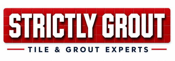
Use the complete supplied logo without stretching, recolouring or rearranging its elements. Leave clear space around it so the mark remains easy to recognise.
Visual principles
- Use Strictly Red for calls to action and key emphasis.
- Pair bold Bebas Neue headings with clear Barlow body copy.
- Use clean rectangular imagery with 15px rounded corners.
- Keep layouts practical, confident and easy to scan.